Introduction: When it comes to finding a new home or property, having a reliable and knowledgeable real estate agent is essential. But in today's digital age, where first impressions are formed within seconds, a well-designed real estate website is equally important. In this article, we'll explore 11 real estate website examples that excel in design and functionality. By understanding what makes these websites great, you can enhance your own website and attract more clients.
Why is your real estate website essential to marketing?
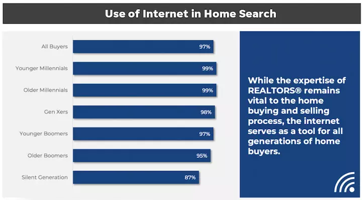
Your real estate website serves as a vital marketing channel, allowing you to attract inbound leads, convince referrals to commit, and showcase your listings. Consider these statistics from the National Association of Realtors:
- 81% of realtors have their own listings on their website.
- 70% of brokers and 69% of sales agents have a website.
- 51% of buyers found their home online first.
These numbers clearly demonstrate the significance of having a compelling real estate website. In an increasingly digital world, your website will play an even greater role in attracting potential buyers and sellers.
 Image source
Now that we understand the importance of a real estate website, let's dive into the examples of unbeatable designs.
11 Unbeatable Real Estate Website Designs
1. The New England Real Estate Company: Make navigation easy
Moving can be a stressful process, and your website should aim to alleviate that stress. The New England Real Estate Company excels in making navigation straightforward. The search bar is prominently placed in the hero section, allowing users to search by various location specifics. The clean design and bright background image create an aspirational feel.

2. Beach & Bartolo: Demonstrate local knowledge
In real estate, local knowledge is essential. Beach & Bartolo, located in Columbia County, New York, showcases their expertise in the area through their website. The navigation bar features badges earned by the agency, highlighting their knowledge and experience. The team photo and agent bio further emphasize their deep ties to the community.

3. NEREN: Prioritize accessibility
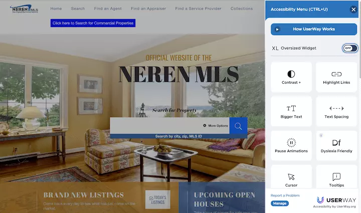
Ensuring your website is accessible is not just a best practice, but also a way to demonstrate inclusivity in your marketing. NEREN, the New England Real Estate Network, has implemented an accessibility widget that allows users to customize their viewing experience. In addition, their website is well-organized, offering specific search options for different regions.

4. Long and Foster: Convey emotion with video
Searching for a new home can be an emotional experience. Long and Foster understands this and incorporates a compelling video on their website. The video showcases heartwarming moments and aims to connect with potential buyers on an emotional level.

5. Dawn McKenna: Cater to your target audience
Understanding your target audience is crucial in real estate marketing. Dawn McKenna's website is a great example of catering to specific customers. The sleek design, high-end elements, and luxury feel appeal to a discerning clientele.

6. Compass: Align your online and offline design
Your online presence should align with your offline marketing efforts. Compass achieves this by maintaining consistency in design across various platforms. By utilizing the same fonts, colors, and design elements in their yard signs and website, they create a cohesive and memorable brand experience.

7. Sotheby’s: Make contact easy
Making it easy for potential clients to contact you is essential. Sotheby's employs a chatbot on their website, strategically prompting visitors to schedule viewings of properties. By offering assistance at the right moment, they enhance the user experience and increase the chances of securing leads.

8. Richard Blanco: Highlight your content and resume
Distinguishing yourself from the competition is crucial in the real estate industry. Richard Blanco's website prominently features his TV experience and other content, showcasing his expertise and establishing credibility. By highlighting your achievements, whether through a blog, podcast, or media appearances, you can build trust with potential clients.

9. McEnearney Associates: Share impressive stats
Incorporating numbers and statistics can enhance your website's credibility. McEnearney Associates uses visually appealing stats to showcase their experience and success. These numbers break up the website's content and make a strong impression on potential clients.

10. Sweet Living Realty: Show your testimonials
Client testimonials carry significant weight and influence. Sweet Living Realty understands this and strategically places testimonials throughout their homepage. By sharing positive reviews and personal experiences, they instill confidence in potential clients.

11. Zillow: Focus on ease of use
While not operated by an agent or firm, Zillow is an excellent example of an easy-to-use real estate website. The simple search options and user-friendly interface make it a sticky platform, attracting millions of visitors each month. Zillow's branding consistency across platforms further contributes to its success.

Real estate website design takeaway tips
To enhance your own real estate website, keep these key takeaways in mind:
- Make navigation easy for a stress-free user experience.
- Showcase your local knowledge and expertise.
- Tailor your website to cater to your target audience.
- Include trust signals such as awards or partnerships.
- Utilize numbers and statistics to demonstrate your success.
- Feature customer reviews and testimonials to build trust.
- Maintain consistency in branding across online and offline channels.
- Make it simple for potential clients to get in touch with you.
- Highlight your content, achievements, and media appearances.
- Share impressive stats to reinforce your expertise.
- Focus on creating an easy-to-use website for visitors.
By implementing these strategies and drawing inspiration from the unbeatable real estate websites mentioned above, you can elevate your online presence and grow your real estate business. Good luck!
Note: Image credits and original content source can be found in the original article.


