
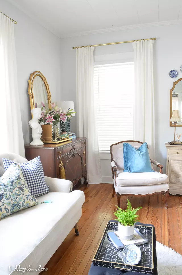
If there's one topic in the realm of interior design that never fails to spark curiosity, it's paint colors. The process of selecting the perfect shade can be quite daunting, with so many brands, colors, and finishes to choose from, and the added challenge of undertones that can vary depending on the space. But fear not! We've got you covered. In this article, we'll share our tried-and-true favorite gray, white, and neutral paint colors that never disappoint.
The Art of Choosing the Right Paint Color
 Sample color swatches
It can be tricky to accurately visualize a paint color on a computer screen, especially when edited to enhance visual appeal and brightness. While we'll provide paint swatches to assist you, we highly recommend getting a sample and applying it to your walls. Different factors such as lighting and room size can significantly impact how a paint color appears.
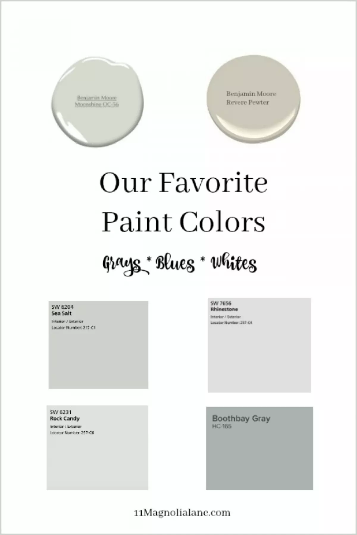
Benjamin Moore - Moonshine: The Perfect Neutral Blend
If you're on the hunt for a neutral color that sits comfortably between white and gray with a warm undertone, look no further than Benjamin Moore's Moonshine. This light, slightly gray hue adds character to any space without overwhelming it. It's a versatile choice that complements a wide range of decor styles. Whether you use it in your dining room, family room, or any other area of your home, Moonshine delivers a sophisticated yet cozy ambiance.
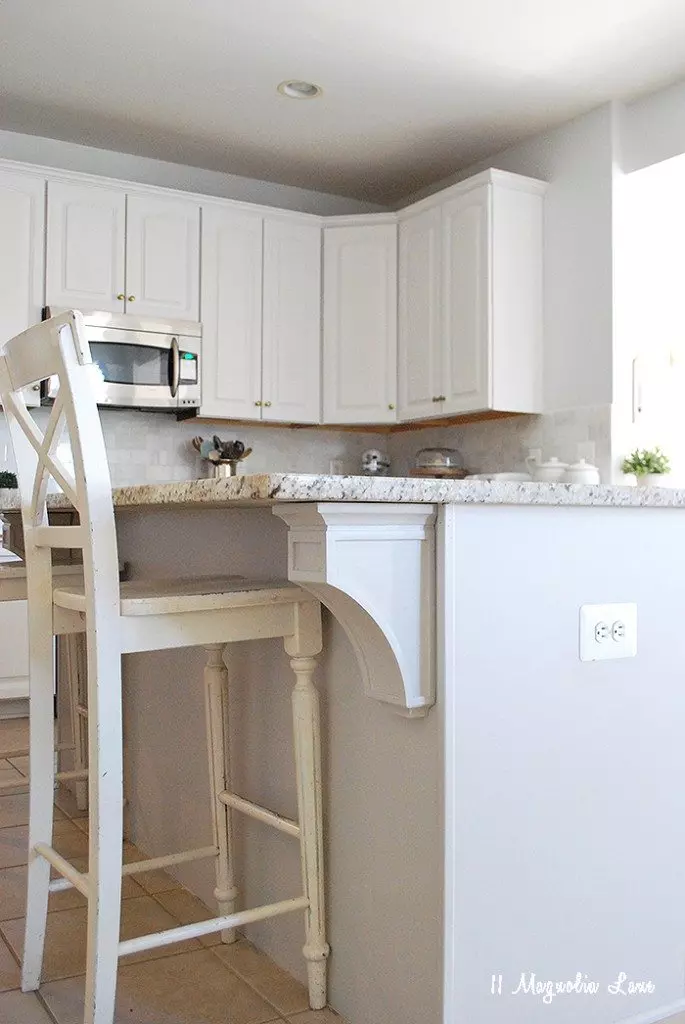
Benjamin Moore - Revere Pewter: A Subtle Gray-Greige Delight
Revere Pewter by Benjamin Moore
For those seeking a gray-greige shade with a bit more saturation than Moonshine, Revere Pewter is the answer. In my kitchen, I found that Revere Pewter perfectly complemented the white cabinets, striking a harmonious balance between warmth and neutrality. This versatile color effortlessly adapts to any space and works wonders if you're aiming for subtle, contemporary elegance.
Sherwin Williams - Rhinestone: A Cool and Serene Atmosphere
 Rhinestone by Sherwin Williams
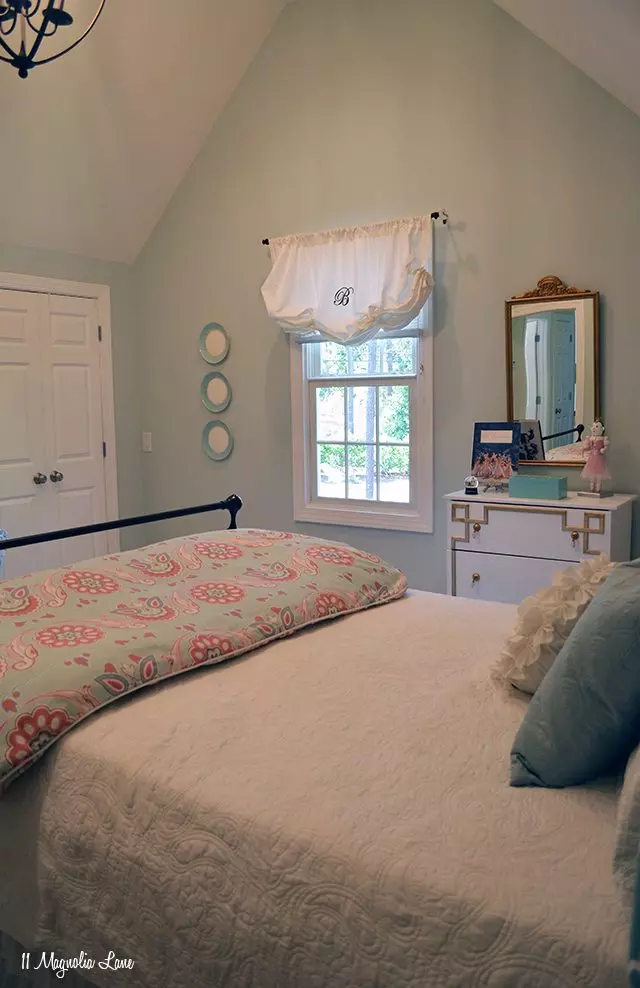
Sherwin Williams' Rhinestone is a delightful cool light blue-gray with strong blue undertones. Although different lighting can make it appear white, gray, or even pale blue, it consistently exudes an air of tranquility and beauty. Whether you choose to paint your breakfast room or bedroom, Rhinestone creates a serene ambiance that promotes relaxation.
Sherwin Williams - Sea Salt: The Calmness of Coastal Living
Sea Salt by Sherwin Williams
Sherwin Williams' Sea Salt has repeatedly proven its worth in numerous rooms, as demonstrated by Christy, who used this color in her daughter's room across three different homes. Combining elements of Rhinestone and the bolder blue-gray palette, Sea Salt beautifully captures the essence of coastal living. Its unique blend of blue and gray undertones adds a touch of sophistication to any interior design project.
Sherwin Williams - Rock Candy: A Timeless Classic
 Rock Candy by Sherwin Williams
In Christy's new home, Sherwin Williams' Rock Candy takes center stage, perfectly complementing the traditional accents present in older homes. This light gray shade showcases delicate pale blue undertones, offering a timeless classic feel that effortlessly enhances any living space.
Benjamin Moore - BoothBay Gray: A Striking Crisp Blue-Gray
 BoothBay Gray by Benjamin Moore
For a captivating pop against white elements, look no further than Benjamin Moore's BoothBay Gray. This crisp blue-gray shade adds a touch of vibrancy and character, making it an ideal choice for bathrooms and boys' rooms. It even works wonders as a cabinet color against lighter walls, creating a visually pleasing contrast.
We hope these paint color recommendations have provided you with inspiration for your next interior design project. Stay tuned as we'll be sharing our newly painted living room soon, showcasing the transformative power of color. And remember, if you ever need to inject a little beachy vibe into your space, Benjamin Moore's Woodlawn Blue is an excellent choice!
XO, -Amy
If you enjoyed this article, we'd love to have you subscribe to our Sunday newsletter. It's filled with inspiring content and other fun things we've found to brighten your day. Sign up below!
Click here to subscribe


