
Gray, the subtle blend of white and black, holds a captivating allure in the art world. However, did you know that the key to manipulating gray lies within the composition of black itself? Let's delve into the intriguing world of warm and cool grays and unlock their artistic secrets.
How Black is Mixed: Unleashing the Power of Control
Black, a potent color in its own right, offers artists the opportunity to mix their own shades. By crafting their own black variations, artists gain control over color temperature and intensity, resulting in more natural-looking blacks that harmonize with their artwork.
 How to mix black
The finest black hues are achieved by combining a rich blue with a deep brown. Darker browns and blues prove to be the most effective in this regard. For instance, blending Indigo Blue with Dark Umber in colored pencils (Prismacolor) produces a marvelous black. What's interesting is that the concentration of blue or brown determines the temperature of the resulting black.
If you emphasize blue in the mix, you'll achieve a cooler black. Conversely, a higher concentration of brown imbues the black with warmth.
 How to mix a cooler black
How to mix a warm black
The significance lies in the inherent nature of blue and brown as cool and warm colors, respectively. Brown exhibits fruity notes of orange, making it akin to a darker shade or value of the warm hue.
Mixing Warm and Cool Grays: A Kaleidoscope of Possibilities
Mixing the cooler black with white results in a cooler gray. On the other hand, the warmer black combined with white presents a warmer gray. By employing various pigments of blue and brown and blending them with white, a multitude of grays with different color temperatures can be created.
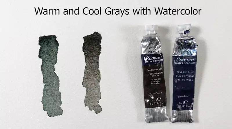 Warm and cool grays with watercolor
This technique transcends medium boundaries, as demonstrated by the mesmerizing warm and cool grays mixed with watercolor.
In the first example, Prussian Blue dominates the mixture, giving birth to a cooler gray. Meanwhile, the second example showcases Burnt Umber's dominance, resulting in a warmer gray.
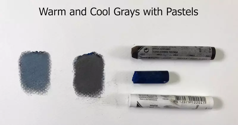 Warm and cool grays with pastels
Layering a darker blue over a darker brown in pastels and gently blending the mixture before adding a light layer of white yields a captivating cool gray. Conversely, layering a darker brown over the dark blue, followed by a gentle blend and a touch of white, creates a soothing warm gray.
Intensities of Warm and Cool Grays: Unveiling the Spectrum
When gray is mixed with a hue, the color intensity undergoes transformation. For instance, blending gray with blue yields a less vibrant, duller version of the blue. The introduction of gray dilutes and tones down the hue.
Colored pencil manufacturers like Prismacolor offer an array of gray shades in warm and cool varieties, each with differing intensities expressed as a percentage.
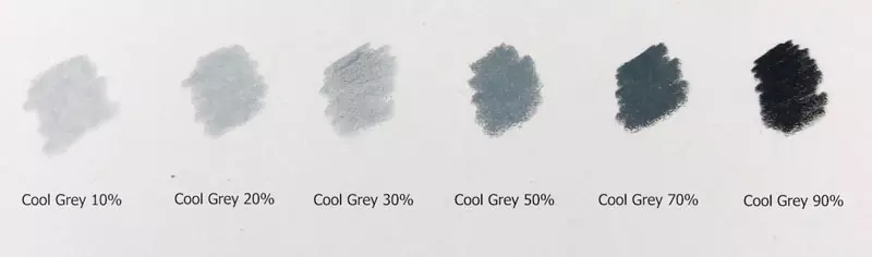 Cool grays with colored pencils
Prismacolor's cool grays include Cool Grey 10%, Cool Grey 20%, Cool Grey 30%, Cool Grey 50%, Cool Grey 70%, and Cool Grey 90%. Similarly, they produce warm grays with the same intensity levels.
Colored pencil drawing with cool and warm grays
As the percentage increases, the gray's intensity magnifies, offering a diverse range of possibilities.
When to Use Warm and Cool Grays: A Subjective Perspective
Determining when to employ warm or cool grays is an intuitive process. Observe the gray tones present in your subject closely. If the gray appears warmer, opting for a warmer gray makes artistic sense. Similarly, if the gray leans towards a cooler tone, employing a cooler gray aligns harmoniously.
Grays wonderfully coexist within an image. For instance, both warm and cool grays were utilized in a colored pencil drawing of an elephant to create stunning contrasts.
 Warm and cool grays for contrast
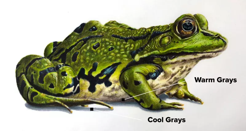
Sometimes, using a cooler gray for shadows enhances the overall visual impact. In a colored pencil drawing of a frog, warm grays were applied to the body, while cool grays were deftly employed for the cast shadow. This deliberate selection amplifies the contrast between the subject and its shadow.
Warm vs. Cool Grays
Remember, there are no hard and fast rules when it comes to gray selection. Trust your instincts and evaluate what feels right for your artwork. Embrace the joy of creativity, experiment boldly, and unleash your artistic prowess.
Images from the original article: sanaulac.vn


